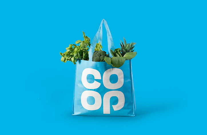
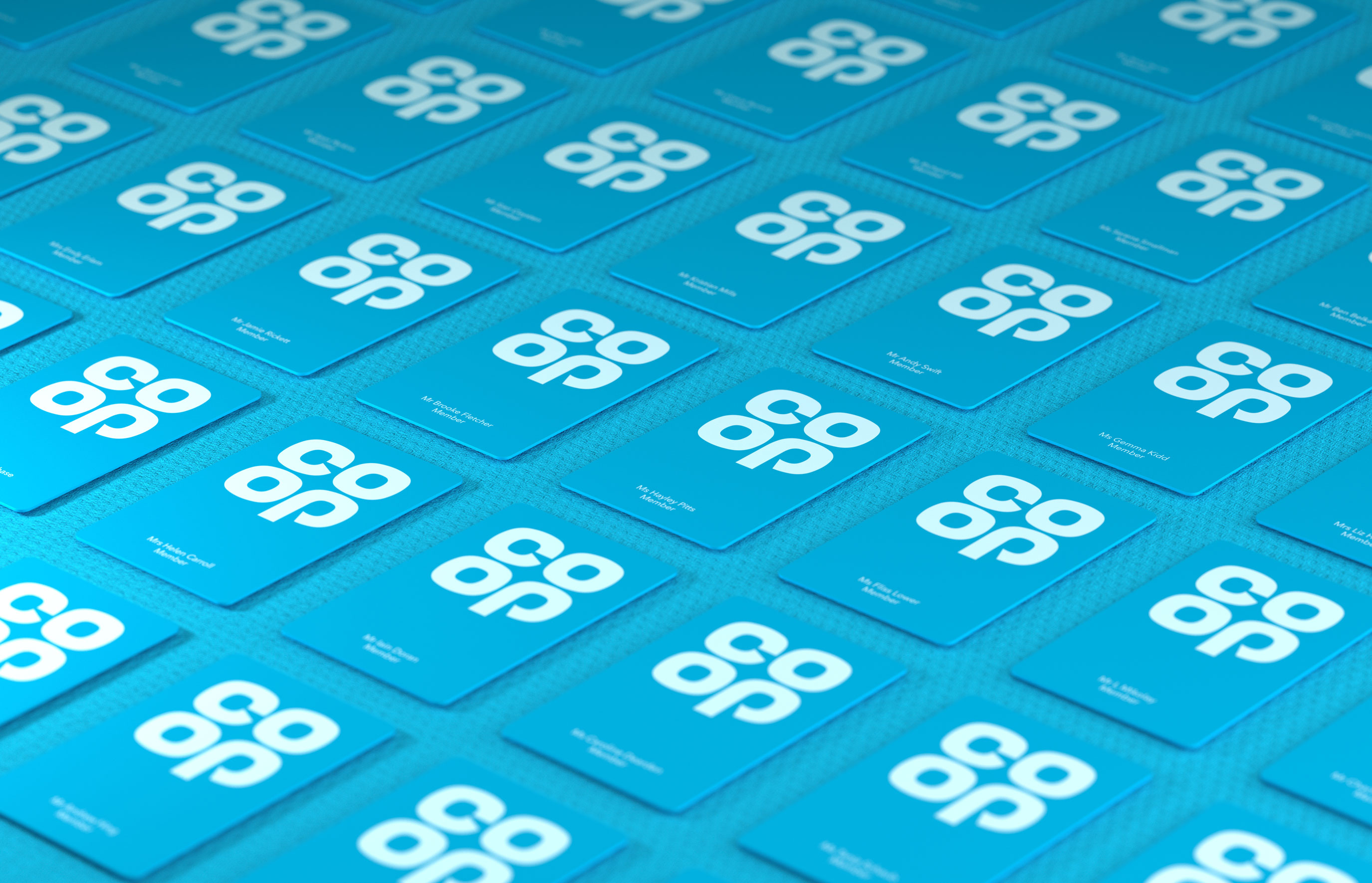
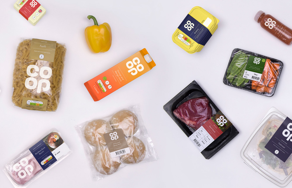
I so often look to the past for inspiration designing for the future. The recent Co-op rebrand is a perfect example of this – to the extreme – recreating a modernised version of the 1968 Cloverleaf logo, which has been designed as a visual reminder of the company’s roots.
I think it works on many levels. It’s iconic, distinct, clean and modern giving a fresh and simple feel to reflect the Co-op today and its range of services and products. The brand is impactful and consistent across all media: food packaging, bags, brochures and livery. With a fresh new colour palette and fonts.
One thing I always hark on about when I’m taking to clients about rebranding is brand personality. Often this hasn’t even been thought about or it just gets lost in the detail of the dry facts of ‘what we do and how we do it’. It really is so important though, so customers have an emotional attachment to the brand as well as a rational one. It’s often how we make a final decision deciding between two similar products or services from different companies.
By looking to the past the Co-op has successfully achieved this. For the older generation it evokes nostalgia but also a company that is happy to move with the times. For the younger generation it suggests a modern brand of the future, ready to live and breathe in the retail and digital world.
Thumbs up Co-op and North – nice job!
Bag

Stationary

Packaging

back to all news or you may also be interested in the news below:
TWEET OR TWO
To ensure you stay in the loop and receive our news, updates and general musings hot off the press, follow us on Twitter now. We promise not to bombard you!


